Chance AI
Redesigned the profile, loading, and share experience of Chance, a visual AI camera app, turning casual snaps into a shareable reflection of how someone sees.
- Role
- Product Designer
- Team
- 4 designers
- Timeline
- 48-hour sprint
- Recognition
- Adobe Designathon Winner
- Tools
- Figma, Figma Make, Adobe Express
Background
Chance is a visual AI agent that helps people understand the world through their camera. With each snap, the app turns curiosity into understanding, translating a single glance into cultural, historical, and personal context. Uniquely positioned in a market flooded with text-based chatbots, Chance leads with vision.
The Problem
Rather than treating these as three separate design challenges, we unified memory, loading, and sharing around Chance's visual-forward philosophy, building an experience that feels engaging, personal, and worth sharing with others. The redesign tackled three specific questions:

Research
Before sketching, our team audited Chance's existing flows and mapped where it sits among the tools people already point their cameras at. The goal was to understand why someone would open Chance instead of the search and chat apps already on their phone.
Pointing a camera at something to learn about it is already a habit. Chance doesn't have to teach the behavior, only give people a reason to keep what they find.
Chance's analysis took around 15 seconds, past the point where attention drifts, and filled it with scrolling text.
For younger users, search is about taste and inspiration as much as answers, which is the territory a shareable, visual result can win.
| Tool | Built for | What you get back | What it keeps over time |
|---|---|---|---|
| Google Lens | Identifying and shopping | Visual matches and search results | Search history |
| ChatGPT / Gemini | General questions | A text answer in a chat thread | Chat history |
| Pinterest Lens | Inspiration | Visually similar pins | Boards you curate by hand |
| Chance, before | Cultural and historical context | A text-heavy breakdown | A chronological feed of snaps |
Every tool answers the photo in front of you. None of them turns a person's own photos into something that reflects how they see, and none hands back a result that looks like it belongs in their feed. That gap became the brief for all three features: a profile that remembers, a wait that shows instead of tells, and a result worth sharing.
Wireframes


Profile & Memory
How can we form the “memory” functions for users as they snap new images?
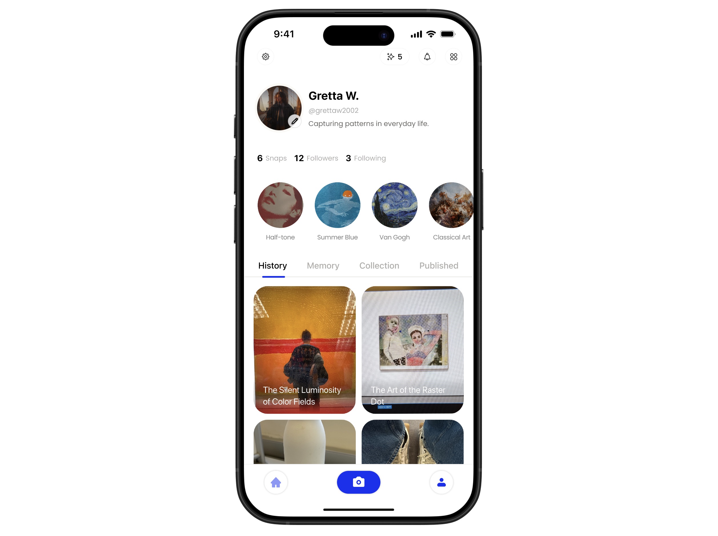
Snaps were organized chronologically, which mirrored an Instagram story without answering why the feature existed. It overlapped with the native photo album and gave users no reason to return to it.
The redesigned profile drops the chronological feed and surfaces what the AI detects the user actually photographs: flora and fauna, brutalist facades, vintage signage. Those patterns become living theme collections that grow as the user keeps shooting. Over time the app assembles a visual personality profile, so the page reads as a portrait of someone's eye rather than a record of their camera roll.


Loading UX
How can we improve the waiting experience while the model is thinking?
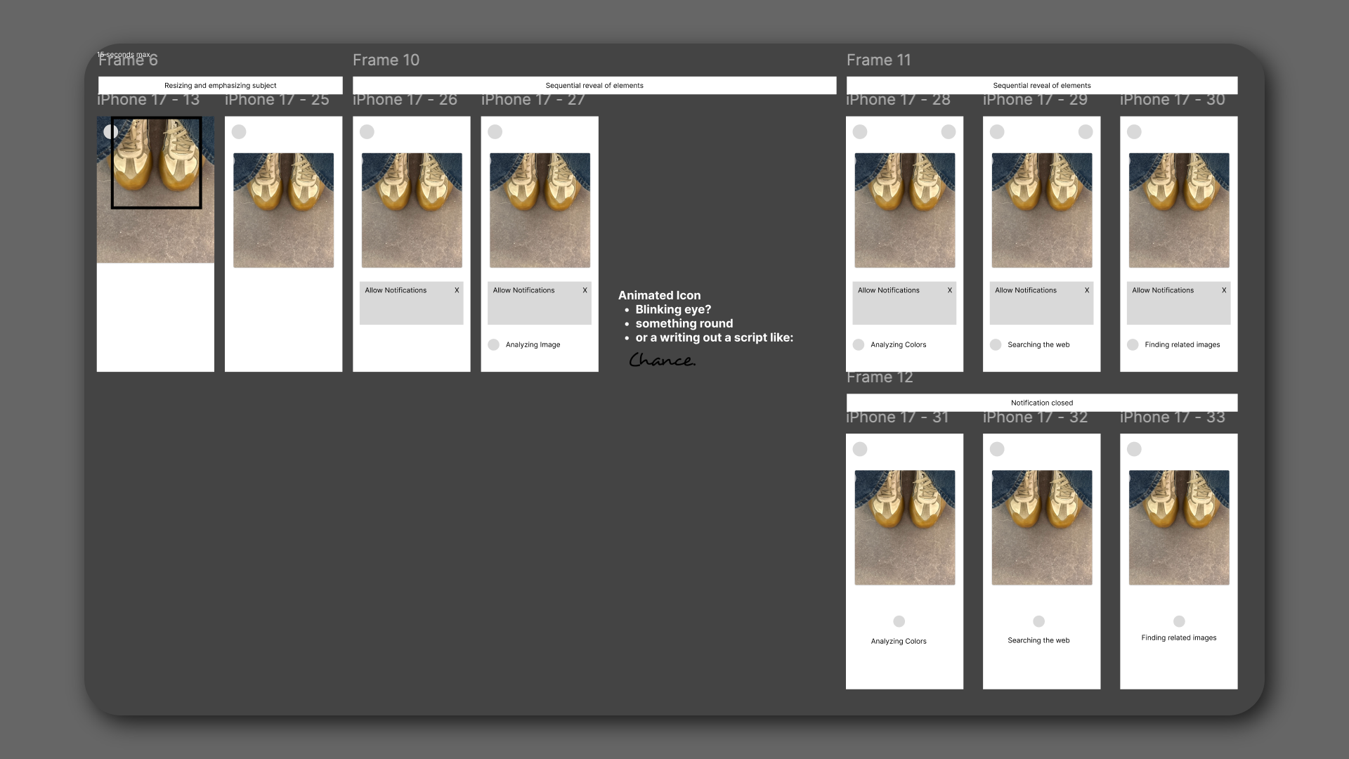
A 15-second wait was filled with a scrolling log of backend tasks. It was text-heavy, visually noisy, and at odds with a product built around visual thinking. Chance tells users that typing is dead, then types at them for fifteen seconds straight.
We replaced the log with a visual that holds attention for the full wait. The fifteen seconds stop reading as dead time and start reinforcing what the product is arguing: that thinking happens in images, not text.

Share Feature
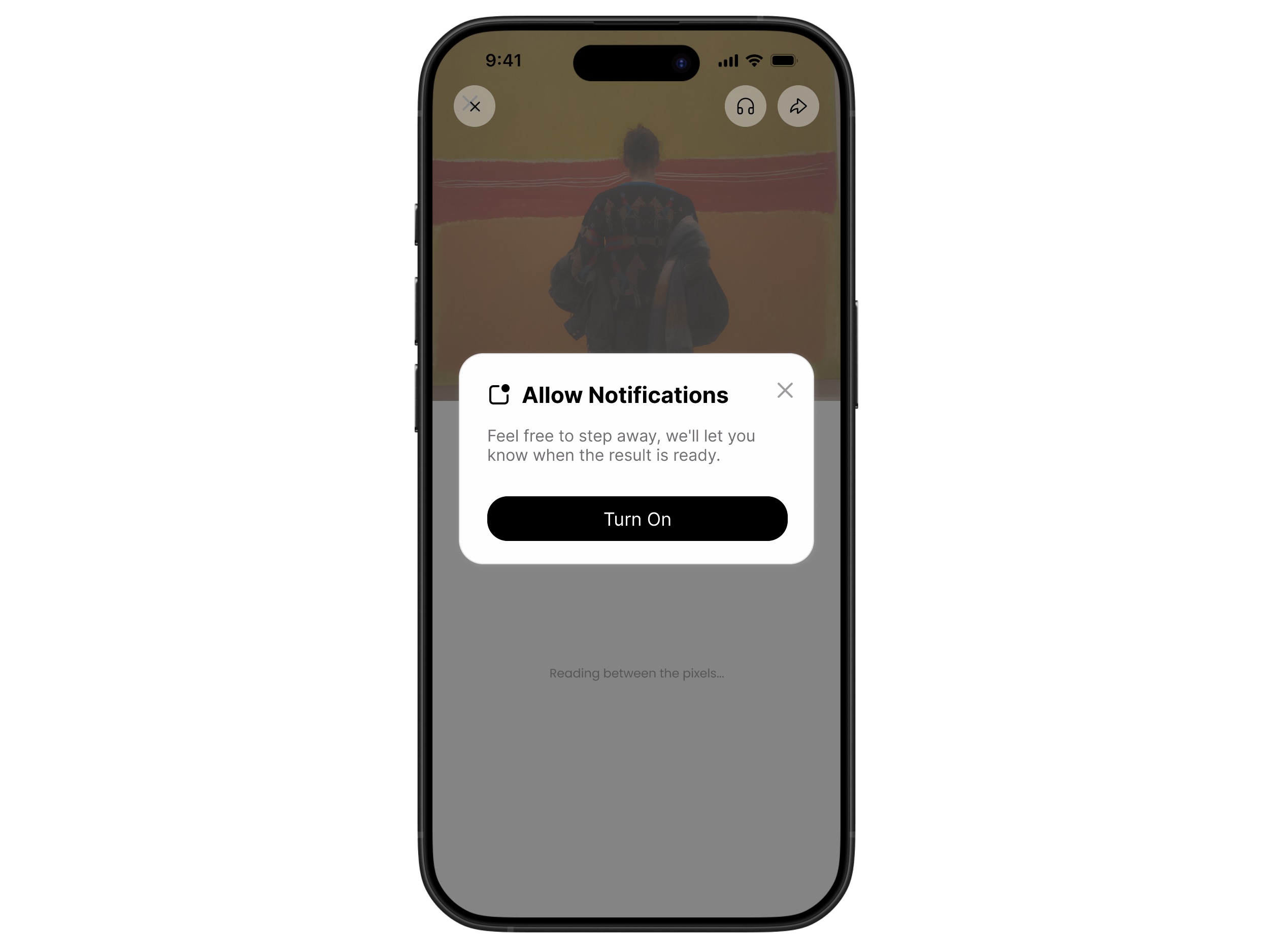
How do we make users want to share their discoveries on social media or with friends?
There was no moment worth sharing. Results read as LLM query outputs, and nobody posts a query output. Nothing the app produced felt like it belonged to the user or looked native alongside what already fills an Instagram feed.
Sharing is rebuilt around the theme collections. Once a collection reaches enough images, Chance composes them into a mood board the user did not have to assemble. The artifact is made from their own photographs, so posting it shares their eye rather than an app result.


